Tuesday 14 December 2010

Pictures of finished tshirts - collaboration

Here are the final Illustrations that Sophie screen printed onto fabric and made them into tshirts for her target age group. There are elements that have been beaded into the illustrations to add colour and detail to them. I like this as we found that it made them more appealing to a young girl who liked sparkly bits on the tshirts as opposed to just the drawing itself. I would like to try making the tshirt for myself, even if I buy a tshirt and screen print the image on to have one for myself. I would also like to try using an image like this and making it into a pattern of sort to be used as an interior or over a larger scale as the whole of the fabric being made into a tshirt or a jumper. Something to keep in mind.

Stills from the Film


Here are some stills from the making of the film that I did toward bringing my project together. After talking to my tutors, it seemed viable to have something to present the work that would help explain the detail and reasoning behind it all, not just the fact that it was made of a lot of different shapes. I like the idea but felt rushed in making the film and if redoing it, would like to have an area with proper lighting and a high resolution camera as the video camera that I used did not give the best picture quality that I would have liked, but still worked ok. It may have been the programs that I used to compile the video, needing to use iMovie to make it all come together. I then used garageband to record my own voice and adapt it to use as a track behind the footage. I got my family to help me make the films, as there were 5 or different elements to it, that all made up the film. Although as I said, more footage, better lighting and a consistent, high quality camera resolution would have been the next step to take after making this film.

Wallpaper in context

After producing the large sheet of wallpaper, I took pictures of each of the sections of the wallpaper and then compiled them in photoshop, repeated the pattern to form a wallpaper sheet. I then applied this into context to see whether it would work in a domestic environment. I think it does but would like to see what it would look like if the wallpaper was custom made by hand for someone so that all of the marks would be individual as I feel this has a feeling of repetition. Or maybe better photography that is more inline would make it easier.


Work Larger

After creating the symbols at a smaller scale, it was suggested that I do it at a larger scale... so I created this A1 black stamped version which i liked, but felt it needed to be bigger... however long it took me. Also that I wanted to try it in colour to make it more subtle a delicate. The image below shows the colour version I did. I wanted to use gold and silver to show a precious like feel to the work.

The idea of working even larger then A1 was suggested by a class mate, and I did this on a wallpaper roll I had left over from a previous piece of work. It was not the whole roll but took me around 6 or more hours to complete it. I am pleased with the outcome and feel that it needed to be done by hand as it make each mark individual. What I keep being asked is if there is a pattern to the symbols, and the truth is no. It is random as to which shape I pick up next as I feel when memories are formed we do not know what is going to be taken in, unless concentrated on in more detail. Otherwise we cannot predict the future and what memories are going to be formed, therefore why should there be some sort of plan as to the pattern of my work.

Further Developments within the shapes

The next step was to add colour to add a more defined separation between the different shapes (or representations of senses). I wanted to try to use different tones to see what the image would look like. The above has stronger, more dominant colours that may seem quite harsh, whereas below I have used more subtle skin tonal colours as I felt they may relate to the idea of senses and in turn memory better.

As well as experimenting with colour, the idea of using string as a way of visually explaining connections within the brain, and the strength of the connections affecting the formations of memory, was another exploratory idea. The symbols were the same, such as the type of cells that form memories, however the colours of the string differed for each of the different senses. Could use the thickness of the string as an additional aid to differentiate the strength memory being formed.

Another initial experiment is shown below. The idea of memories being retrieved by a cue or trigger from one of our senses. Whether it be that we smell something that reminds us of something else or during having a conversation, what somebody says leads on to what we say next. This is shown by the small shape inside the large one being the same as the previous large shape. Well maybe not so much in this image but that was the general idea.


Sunday 5 December 2010

Defining memories further


Ive added some symbols within the 'neuronal neworks' to make it more intricate and make the viewer want to look at the image in more detail. Each of the different symbol is meant to represent one of the emotions that we carry according to..... Ive also created this idea in a bigger form.

Addition of colour

Here I have applied colour to the same abstract shapes as in the previous post to define the different 'senses' that would make up the different neuronal networks. I think it allows you to see that these shapes and general images are made up on different elements without having to change general shapes as I have done in other images.

Abstract way of looking at Memory topic


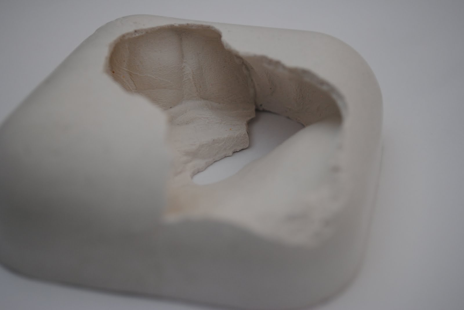
Here are some of the starting images that I produced using different stamps that I had made. They relate to the way in which memory is made, using the physical process of stamping out each shape to get a slightly different outcome each time, like someone's memory. Although we may experience the same event, our memories will never be exactly the same of it.

The first image was an initial experiment, using the same shape repeated; the idea that the memory cells are all the same but what's inside them are not.

The second image related to the idea of neuronal networks that make up different memories. They group themselves together depending on what they are about which makes it easier to retrieve the information at a later date.

The third image touches upon the influence of our senses building up our memories. What we see, smell, touch, hear and taste are the way that we take in information that is changed into a useable form in the brain to be stored as memories, where relevant. Not all information is taken in, just those that seem more important to us.
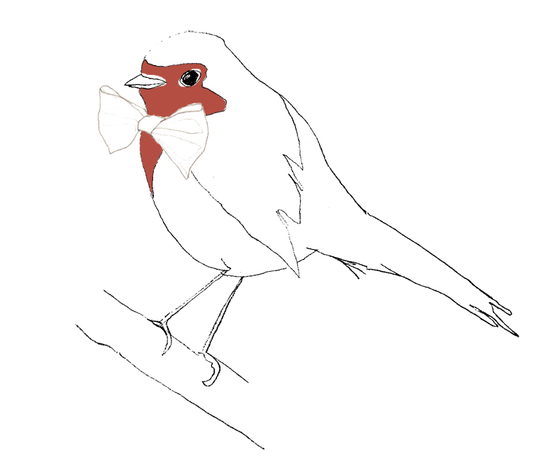


Saturday 4 December 2010

Shot glasses... gone wrong


As part of my project on memeories and object that hold memeory, I was planning on casting the shot glasses collection I have acquired which are from around the world. Two of my friends and I get a shot glass when going abroad and bring it back as a collection. I thought this was a relevant and abstract form of collecting memories, and wanted to show it by casting the negative space within one. However... the plaster would not come out! Going to try soaking them, otherwise they will just be ornaments and not useable.

Friday 5 November 2010

Initial collaboration Ideas


Some initial drawings that I may use on a collaboration with my house-mate on Fashion working with childrens clothes focusing on the theme of British Heritage, using British Animals as a base to cater for a more child friendly audience.

Framing cameras


Cameras are used to take pictures of moment in our lives, as well as many other things. I feel that a camera is now one of the most essential devices used in order to keep record of moments in our lives. Here I have used the image of a camera, replicated it and framed it, playing with the idea of framing a memory, but using the device as the image being framed... needs some work...

More moulds


Developing on from previous moulds, the first of these two moulds is of the inside of my hands clasped together as if i were capturing something inside. It is a mould of the negative space within them, the matter that is being captured. The second image is the mould surrounding the first mould, what it would look like if you were inside the hand.

Memories cannot be caught like fish or kept in a cage like a bird. We capture memories in our lives in many different way, one more popular way being through taking photographs. This development of moulds is pursuing the idea of ways to capture memories, why people capture memories and the inevitability that we are unable to capture a moment for a life time. Make the most of the moment, because it will be left behind as life moves forward.

Friday 15 October 2010

First attempt at moulding

Click here to go back to my website.

After looking at the work of 'Based upon' I was inspired to experiment with some mouldings. Based upon's work uses a lot of different processes but that one that I found most interesting in relation to my work is the use of moulding from locations to incorporation into art for clients. For example in one piece of work they took mouldings of bark from trees as well as other details in a location to make a piece of work related to it. I feel it makes it more personal and referable.

I wanted to try using moulding within my own work to see how it would take my practice forward. My working process involves carrying out ideas I have in order to develop them further or move away from them if they are not successful. In this case I do not feel I have done enough to be able to make that decision. I want to evolve the objects and surfaces that I mould to relate to a specific memory and potential make a collection of little squares that relate to something more specific.

Watch this space for more updates on my progress...

Thursday 14 October 2010

Memories


Start of a new project... as its authorial I got to choose what I wanted to look at. Expanding on from the last major project I carried out on Dementia, I thought I would look at memories, nostalgia, de ja vu, keepsake etc... as you can see in the brainstorm above. I wanted to carry on around the similar sort of topic Id looked at before. Am struggling with a starting point and focus, as memories is quite a big topic. Going to try and get visual and do some printing and drawing of things that come to my mind and see what comes of it.

Made a little 'memory test' for drawing, or at least experimented with one. Picking some objects that were close by, I drew the object without looking at the paper, then without looking at the object, and then looking at both the paper and the object to see the affect that I got from my drawing. I prefer when i wasnt looking at the paper as you can see that general shapes but they are nowhere in the right place which gives a sense of freedom and in some way reflects the way memory works, in having a general idea of things, but they may not be exactly as you remember.

Sunday 22 August 2010

Instructional Designs for a Birthday Surprise


For my Boyfriends birthday I surprised him by taking him up to London. But in order to get him there I gave him a number of cards with instructions on them. On the front of the card were one of the above graphics which displayed the route that would be taken once completing the instruction on the card. For example the first instruction was to get the bus from home to the station, and the image on the front was a basic route of the journey. It didnt really add anything more to the surprise but I had fun designing the different cards.

Friday 16 July 2010

Logo Design Ideas for Childminder


Here are some of the logos that I designed for my mums childminding business. She wanted a certain style of teddybear and the jacket related to what the children wear when on trips. I wanted something simple with basic colours but a character that seemed sweet to look at. Hopefully I have implemented these features in my design. Mum is very happy and as the design is for her that is what matters.

Saturday 19 June 2010

Bean Alphabet


I have created an Alphabet design based on fun nicknames that some of my friends and me share among ourselves. I was going to use the design to put on t-shirt or jumper designs with peoples names on them in the Bean shaped lettering. Having started this project a while ago I have recently finished it and want to work on producing some more of my own work throughout the summer.

Sunday 13 June 2010

All thats on TV is football... so lets do some drawing...


My TV has been taken over by football, and although I don't mind watching England play, am not a fanatic and don't want to watch every single country play. So I thought id do some drawing of animals from photos I took when visiting Whipsnade zoo recently. I want to try and do some more drawings over the summer to build up my drawing skills. I feel the work that I have on my blog does not show the different skills I have... so lets hope this helps!!